A well-chosen awning can enhance the curb appeal of your home while providing shade and protection from the elements. When selecting an awning, one of the most important considerations is its color. The right awning color can complement your home’s exterior, create a cohesive look, and even improve energy efficiency. In this guide, we’ll explore the art of matching your awning colors to your home’s exterior, offering practical tips and design principles to help you make the perfect choice.
- Take Inspiration from Your Home’s Existing Palette:
- Start your awning color selection by looking at the existing colors on your home’s exterior. Pay attention to the siding, trim, and any other prominent features like shutters or doors. The goal is to choose an awning color that harmonizes with these existing elements.
- Consider the Architecture and Style:
- The architectural style of your home can influence your awning color choice. Traditional homes may benefit from classic color options like neutrals, deep reds, or blues. In contrast, contemporary homes often pair well with more modern and bold color choices.
- Harmonize with the Landscape:
- Don’t forget to consider your home’s surroundings. The colors of your landscaping, garden, or natural surroundings can inspire your awning color. For example, if you have vibrant green trees and bushes, an awning with green accents might complement the natural setting beautifully.
- Complement or Contrast:
- You can either complement or contrast your home’s exterior with your awning color. Complementary colors are those located opposite each other on the color wheel, like blue and orange or green and red. Using complementary colors can create a visually pleasing and balanced effect. On the other hand, contrasting colors can add a pop of excitement and make your awning a focal point.
- Think About Climate and Sun Exposure:
- The climate and sun exposure in your region can also influence your awning color choice. In hot, sunny climates, lighter colors tend to reflect more sunlight and heat, helping to keep your home cooler. In cooler regions, darker colors can absorb heat and provide some warmth during colder months.
- Consider Color Psychology:
- Color psychology can play a role in the mood and ambiance of your outdoor space. For example, blues and greens can evoke a sense of calm and relaxation, while reds and oranges can create a more vibrant and energetic atmosphere. Think about the atmosphere you want to create under your awning.
- Test Swatches:
- Before making a final decision, obtain fabric swatches or samples of the awning material in the colors you are considering. Place these swatches against your home’s exterior during different times of the day to see how they look in different lighting conditions.
- Factor in Maintenance:
- Consider the practicality of your awning color choice. Lighter colors may show less dirt and fading but can show stains more visibly. Darker colors may hide stains but are more prone to fading over time. Choose a color that aligns with your willingness and ability to maintain it.
- Ask for Expert Advice:
- If you’re uncertain about color choices or want to ensure a professional opinion, don’t hesitate to consult with an awning specialist or designer. They can provide guidance based on their expertise and experience.
- Think Long-Term:
- While it’s important to consider current trends and personal preferences, remember that your awning is a long-term investment. Trends can change, so consider whether your color choice will stand the test of time and continue to look appealing for years to come.
Examples of Awning Color Coordination
Let’s explore a few examples of how you can coordinate awning colors with different home styles and color schemes:
- Classic Neutrals:
- For a traditional or colonial-style home with neutral-colored siding like beige or white, classic awning colors like forest green, navy blue, or burgundy can provide an elegant and timeless look.
- Modern Contrasts:
- Contemporary homes with clean lines and minimalistic designs can benefit from awnings in bold and contrasting colors. A sleek white home might pop with a vibrant red or deep charcoal awning.
- Nature-Inspired Palettes:
- If your home is nestled in a natural setting with plenty of greenery, consider awning colors that mimic nature. Soft greens, earthy browns, or even muted floral patterns can create a harmonious connection with the environment.
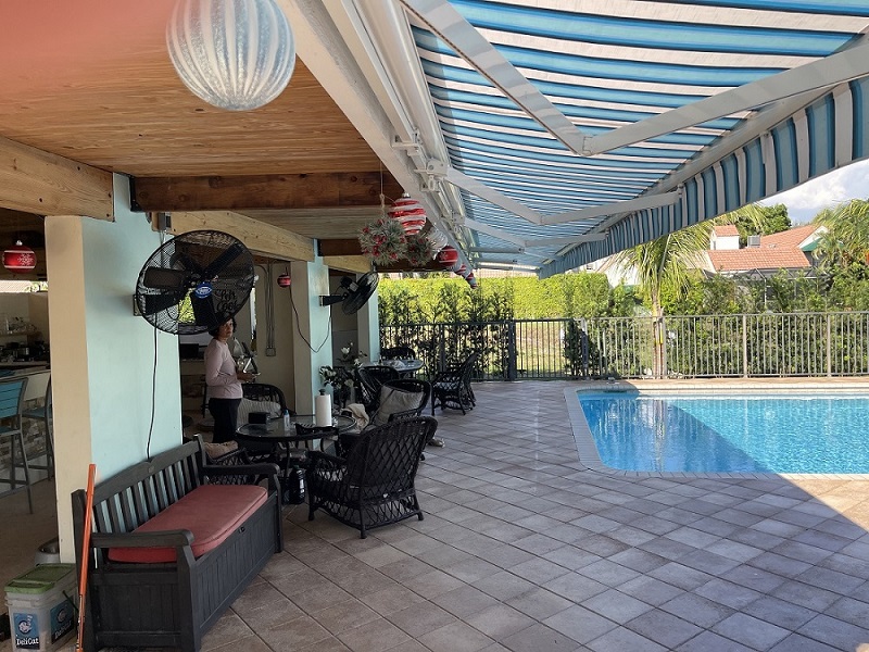
- Beachy Vibes:
- Homes near the coast or with a coastal theme can use awning colors that reflect the beachy vibes. Soft blues, aqua tones, sandy beige, or even a playful striped pattern can evoke a seaside feel.
- Desert Tones:
- In arid regions, homes often feature earthy tones like terracotta, adobe, or sandy beige. Choose awning colors that blend seamlessly with these natural desert hues.
- Cool Comfort:
- To create a cool and inviting atmosphere under your awning, consider shades of blue or turquoise. These colors can evoke a sense of relaxation and tranquility, making your outdoor space feel like a refreshing oasis.
Conclusion
Matching your awning colors to your home’s exterior is a creative and enjoyable process. By considering your home’s existing color palette, architectural style, landscape, climate, and personal preferences, you can make an informed decision that enhances your home’s curb appeal and outdoor living experience. Whether you opt for complementary or contrasting colors, remember that the right awning color can not only provide shade and comfort but also add character and charm to your home’s exterior.